Hyperbuilding A, Centralized Data Infrastructure
Enable cross-disciplinary collaboration through shared data standards, real-time feedback, and transparent performance tracking.
The project was structured around a shared conceptual framework inspired by the Zen practice of Ensō, emphasizing completeness, continuity, and cyclical evaluation. Each design team translated this framework into discipline-specific KPIs, allowing abstract principles to be operationalized as measurable targets.
Overview
For Hyperbuilding A, the Data Team designed and implemented a centralized data infrastructure to support coordination across multiple design teams. Rather than producing geometry, the team focused on organizing information flow, validating data integrity, and translating conceptual goals into measurable metrics that could guide decision-making throughout the project lifecycle.
Data Infrastructure and Automation
Workflow Structure
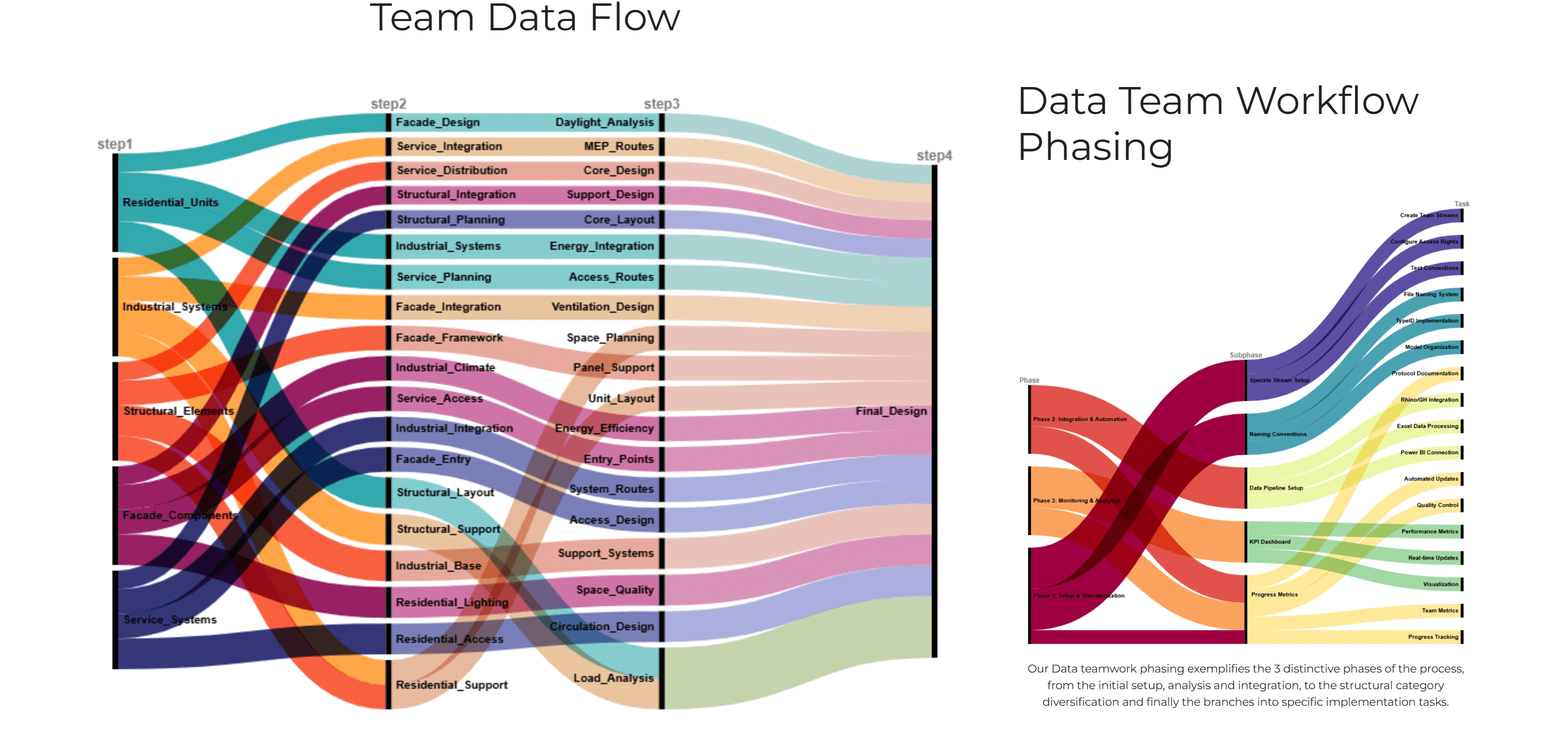
The data system was organized into three phases:
- Setup and integration. Standardized file naming, Speckle project structure, and Drive organization.
- Automation and collaboration. Python-based extraction, validation, and dashboarding.
- Monitoring and feedback. KPI tracking, version control, and real-time communication.
This ensured consistent data exchange while allowing teams to work independently within their preferred design tools.
Data Extraction and Processing
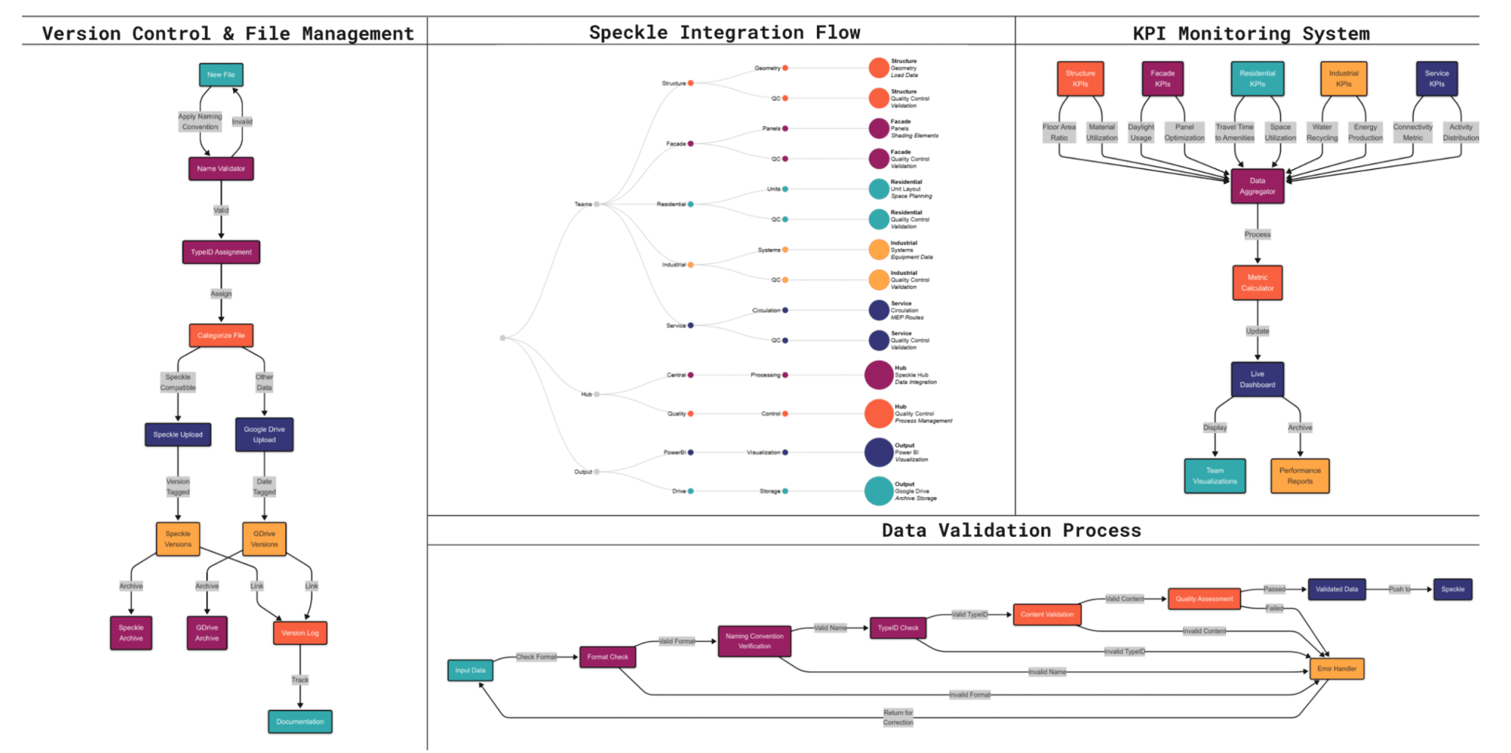
- Automated Python scripts extracted data from weekly Speckle model uploads
- Attribute flattening and targeted searches enabled reliable component-level data access
- Data was parsed into CSVs and processed using preset algorithms
- Metrics were calculated as absolute values and normalized scores, on a 0 to 1 scale
- 92 models processed through the pipeline
- 17 person studio kept in sync
KPI Design
Each team defined 14 KPIs, tailored to their discipline. For example, the Industrial Team’s Energy Self-Sufficiency Ratio was derived from total generation versus demand, rather than component-level detail.
This approach preserved analytical clarity while avoiding direct involvement in BIM or CAD modeling.
Dashboards, Visualization, and Communication
Dashboard system
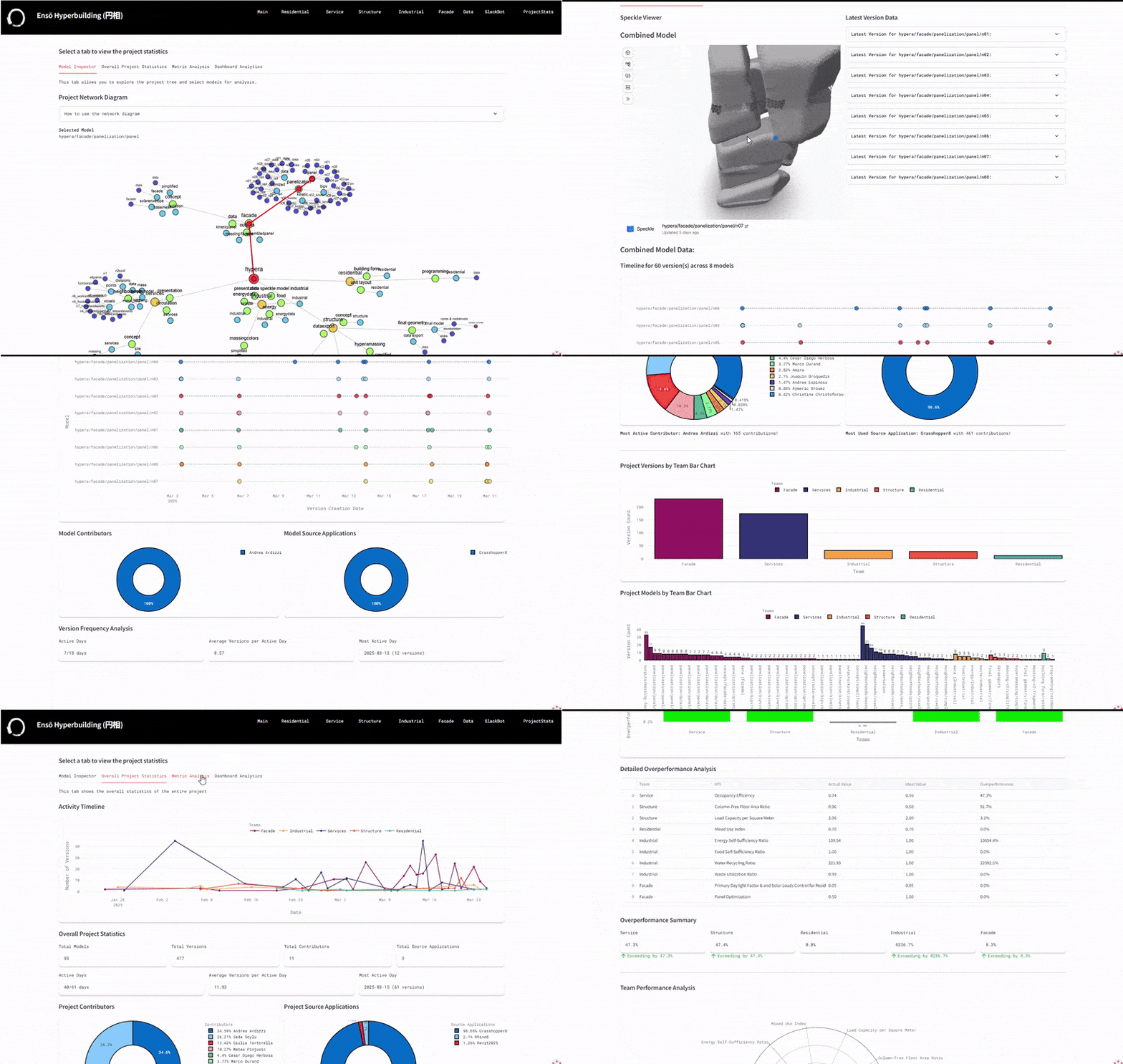
Two levels of dashboards were developed:
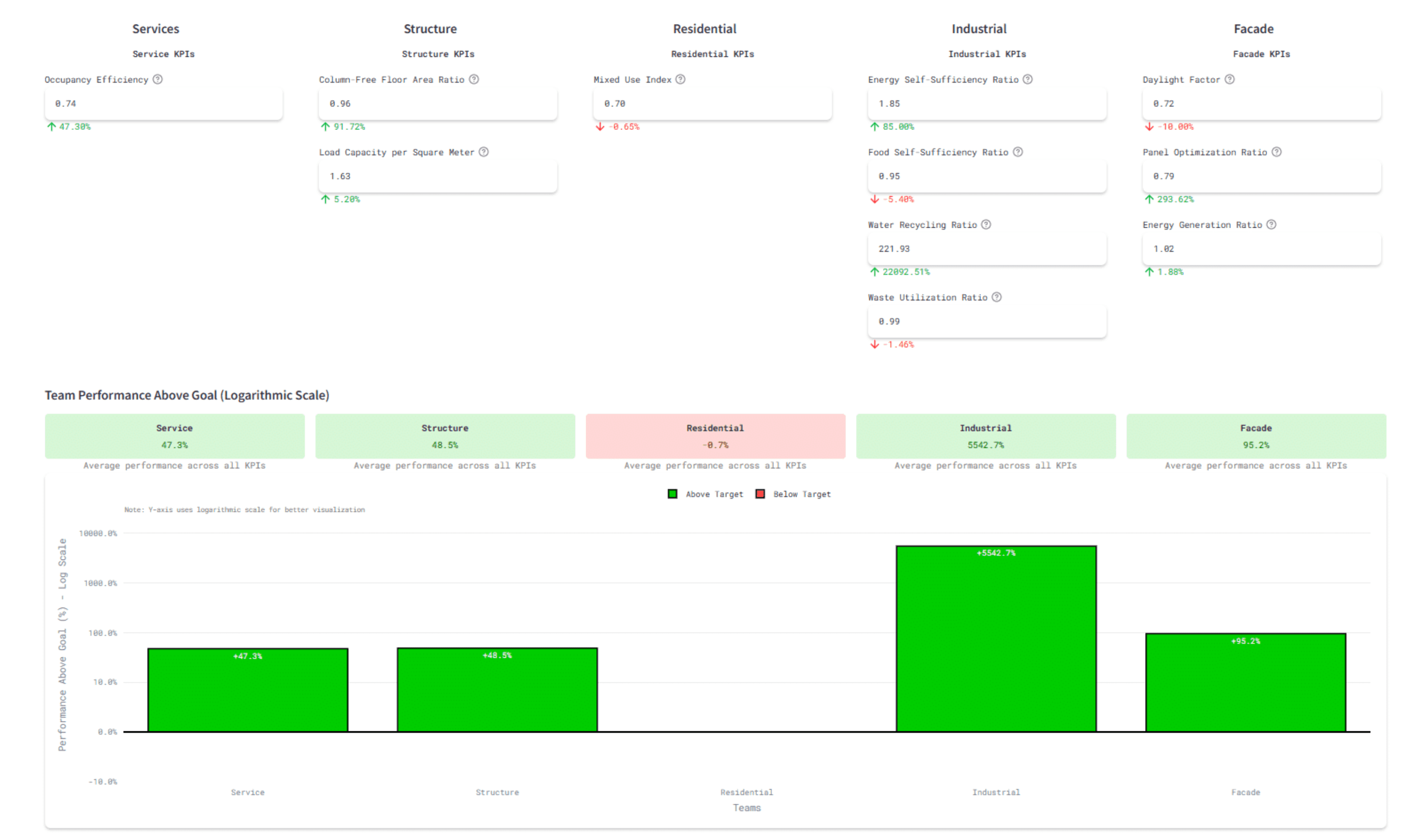
- Project-level dashboard: overview of team concepts, KPIs, and federated model status
- Team-level dashboards: detailed metric breakdowns, interactive calculators, and version tracking
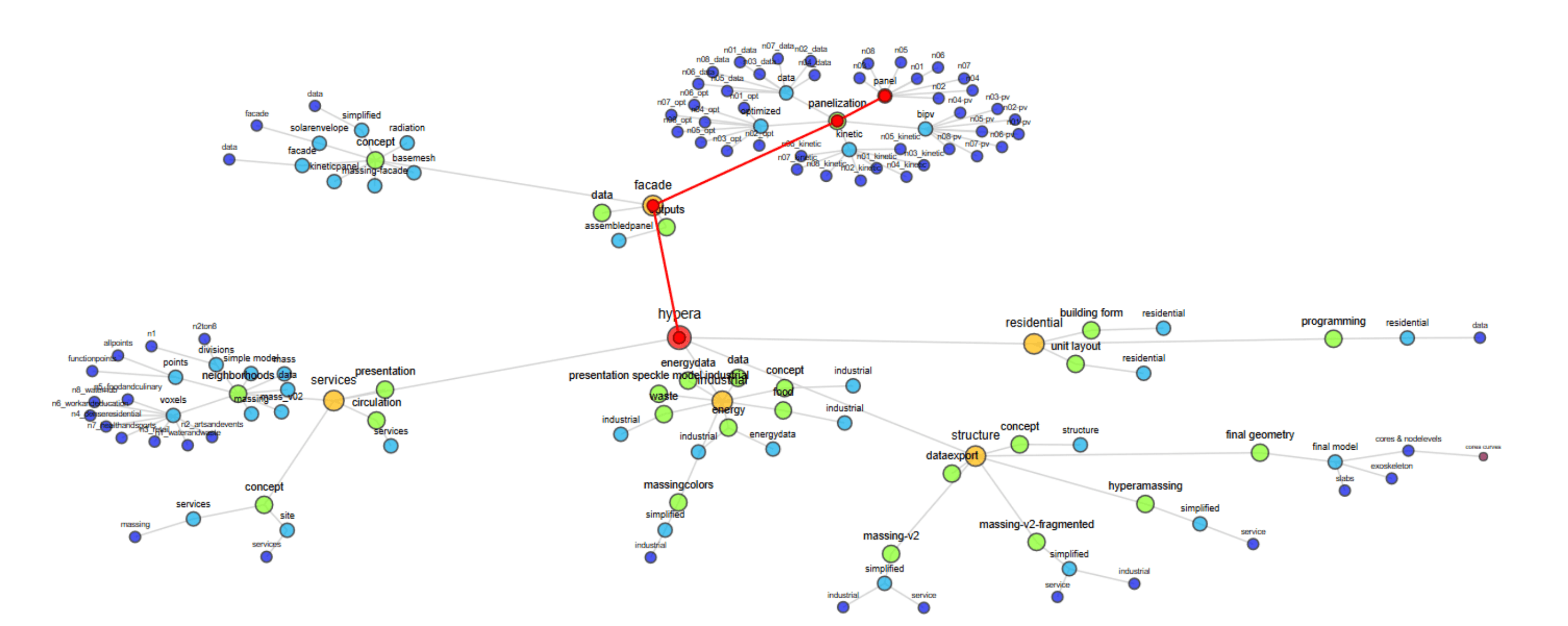
Network diagrams visualized model dependencies and relationships between teams.
Visualization strategy
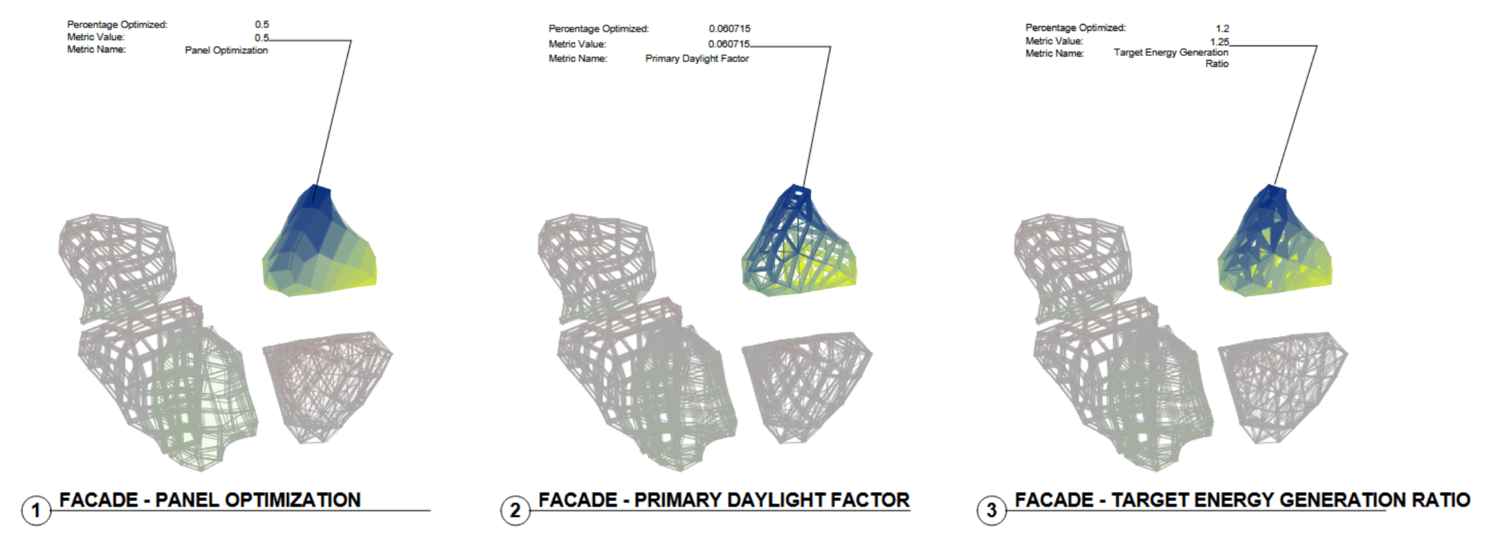
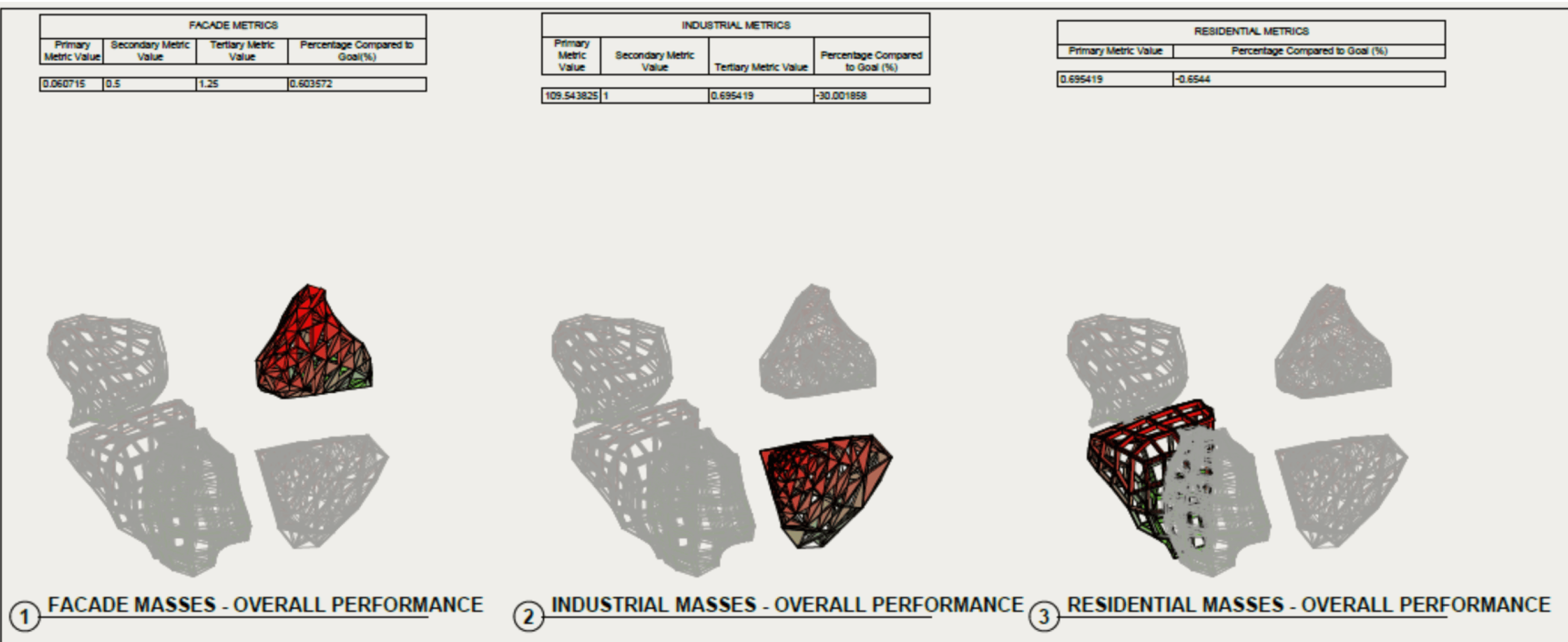
Performance metrics were translated into spatial feedback:
- Team performance visualized on a red to green gradient, from the 0 to 1 normalized score
- Individual metrics visualized on a blue to yellow gradient
- Gradients applied to Revit materials, views, and schedules
This allowed immediate visual comparison of performance across teams and project areas.
Custom panels and adaptive families
- Adaptive panel families consolidated primary, secondary, and tertiary metrics
- Metrics linked to Revit shared parameters via custom tags
- Automatic updates kept Grasshopper calculations, dashboards, and Revit documentation aligned
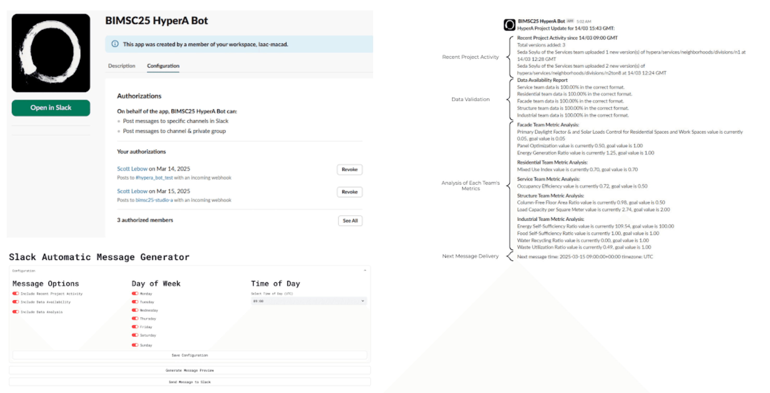
Communication Layer: SlackBot
Reduce manual monitoring by delivering automated project updates directly to Slack.
Features.
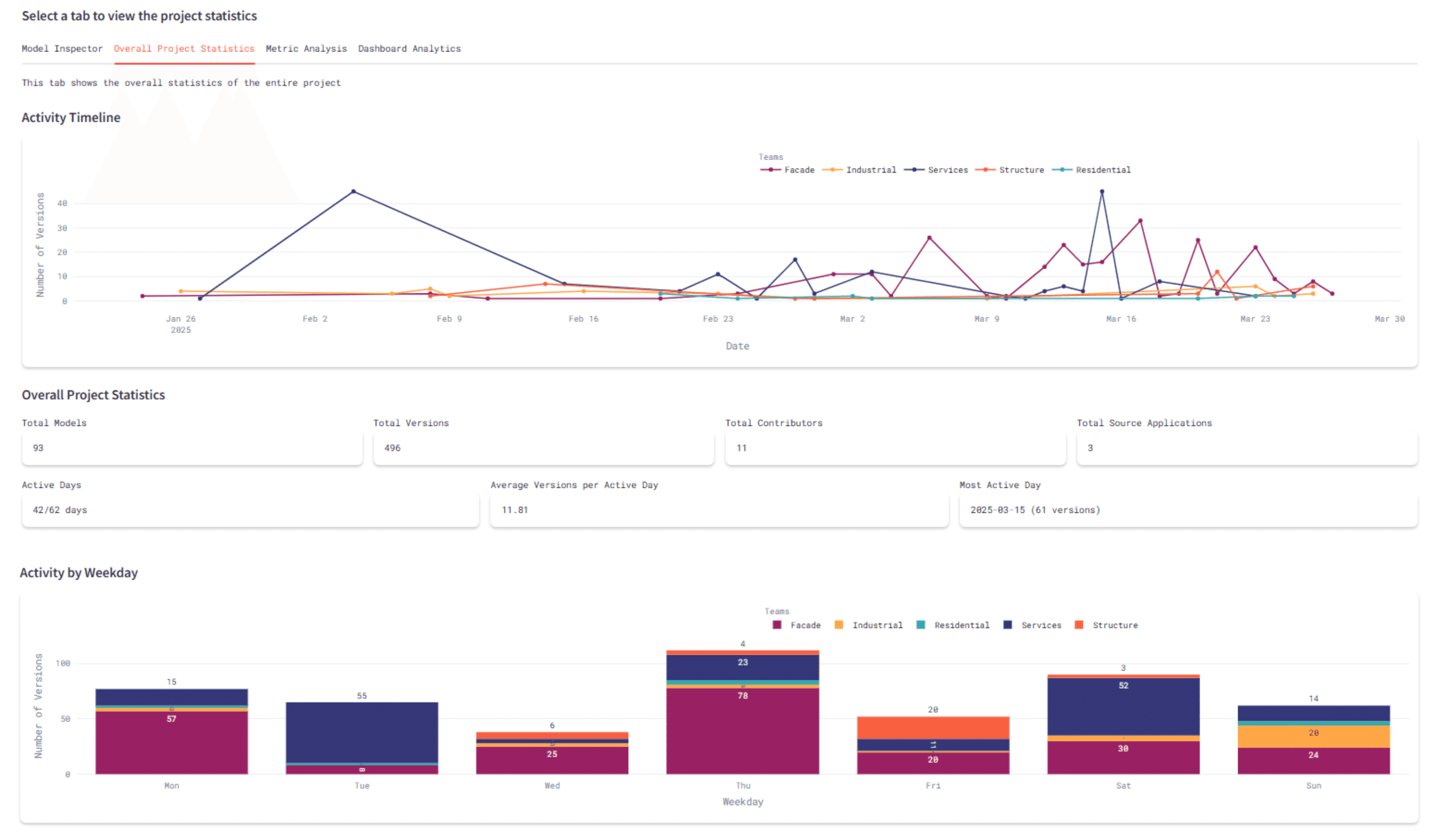
- Recent activity: model updates, versions, contributors
- Data availability: format compliance and missing KPI detection
- Data analysis: KPI scores normalized to studio goals
Implementation.
- Hosted on a Streamlit server
- Scheduled execution with Slack webhooks
- Configurable content and reporting frequency
- Dashboard outputs converted to markdown for Slack delivery

Outcomes and Evaluation
Outcomes.
- Reduced cognitive load for design teams
- Improved visibility of KPI performance across a 17-person studio
- Enabled live monitoring of data health
- Encouraged consistent data submission through automated reporting
Limitations.
- SpecklePy extraction speed limited real-time updates
- Separate data-only models were required when design models lagged behind
Deliverables.
- Centralized dashboards, at project and team level
- Automated data extraction and KPI calculation scripts
- SlackBot for real-time communication
- Revit model with applied performance gradients
- Grasshopper definitions and PDF schedules